Just Eat
rebranding concept
Share this project on your profile.



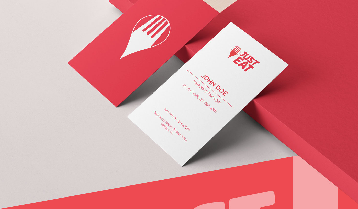
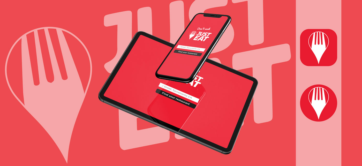


In this project we realized a rebranding concept for the Just Eat logo. Before 2020, the company had always chosen solutions in a purely textual form, thus not using any symbol that could convey the meaning of its service. Just Eat is a well-known company, its name is now in our vocabulary, especially when we want to eat something tasty, without having to cook or go to a restaurant. However, analyzing the existing logo we thought that it was not fully able to express this concept. The goal we set ourselves was to define a concept that could synthesize the value proposition of the company within a simple and recognizable symbol.
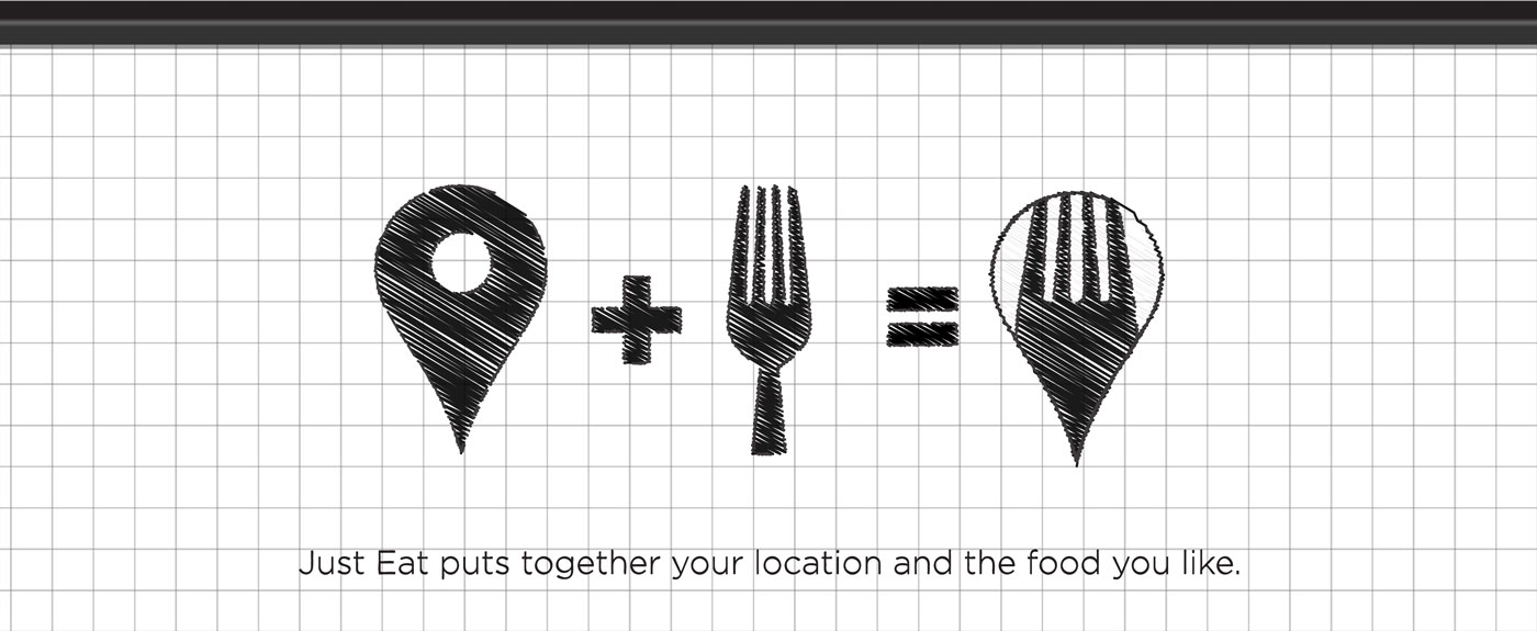
We started from the analysis of the essential function of Just Eat. In extreme synthesis? Delivering your favorite food, wherever you are. We then considered what could be two iconic elements of the ideas of meal and geographical position. Fork and location pin were the result. Through the union of these two elements, we started to realize the symbol. At this point we chose to place the fork inside the pin, to symbolize that the meal you want to eat so much, will arrive right inside your home, or office, or why not, at the park: in short, wherever you are! The result is an immediate symbol, which communicates with simplicity the value offered by the company.
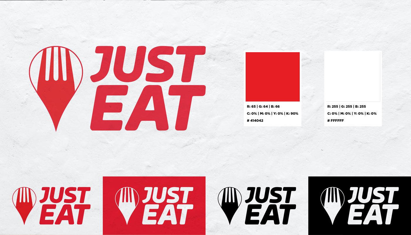
For the textual part we decided to keep the font already used by Just Eat. The company has in fact made over time important investments in marketing to make its brand recognizable and position it clearly in the minds of its users or potential users. Changing font would have meant vanishing the communication efforts already made. In this rebranding we wanted to preserve the history of the brand, adding an original element but without radically changing the image with which we are used to recognize it.
Share this project on your profile.

